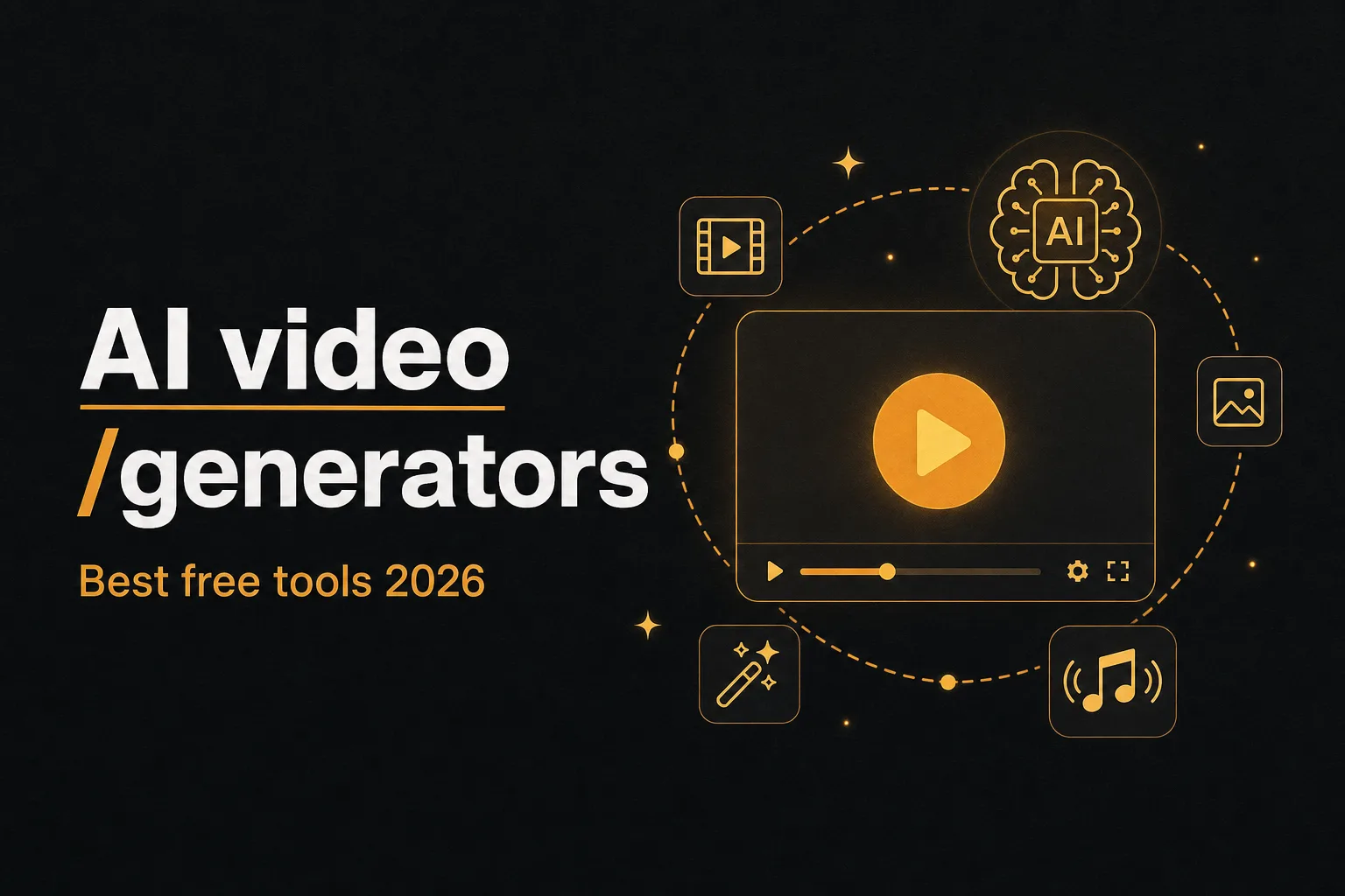
11 best free AI video generators in 2026 (tested)
We tested the best free AI video generators in 2026: real free limits, watermarks, output quality, and which tool fits text to video, image to video, ads, and faceless content.
Insights, strategies, and tools to elevate your content and grow your business
We tested the best free AI video generators in 2026: real free limits, watermarks, output quality, and which tool fits text to video, image to video, ads, and faceless content.
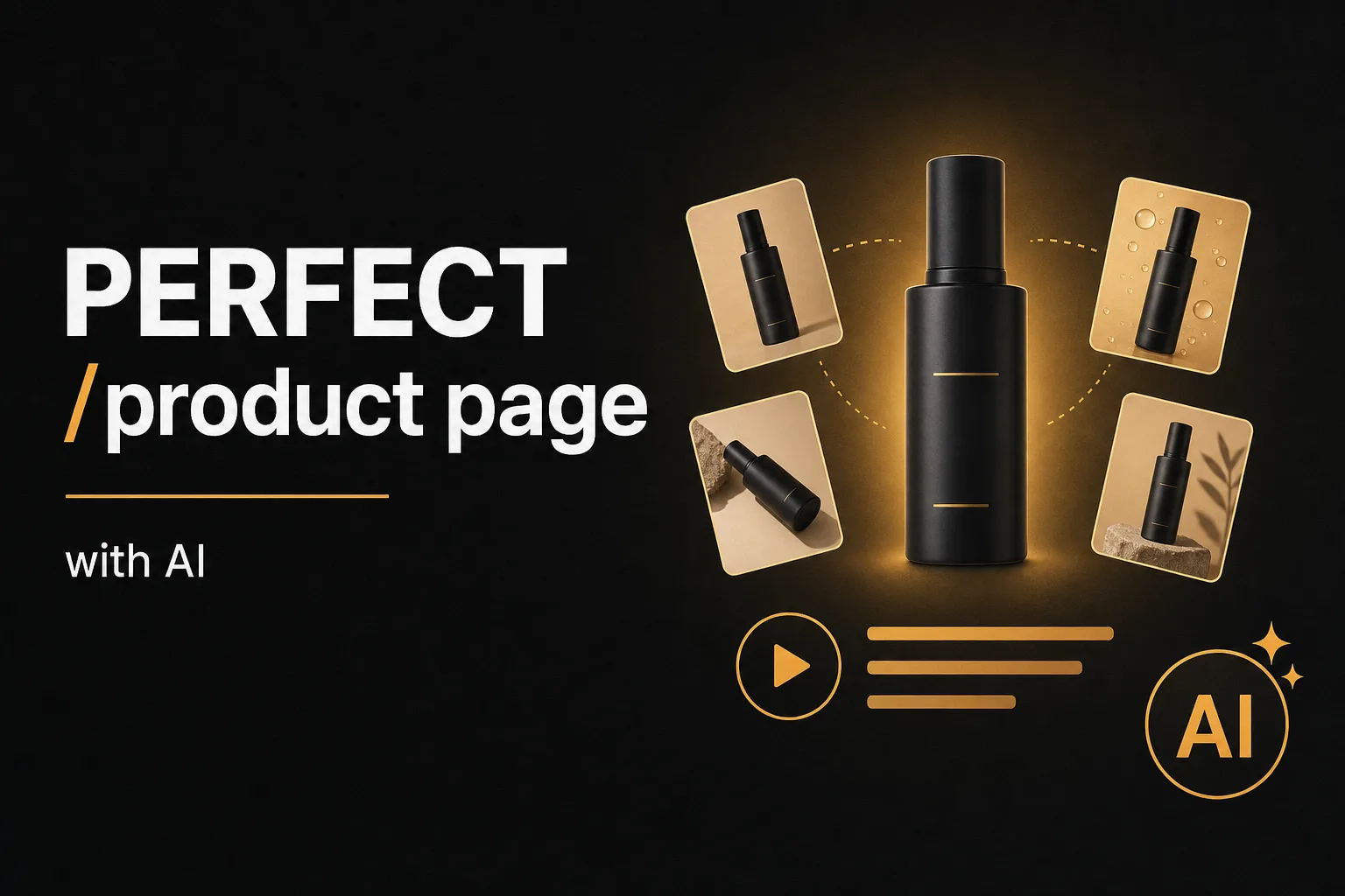
Turn one supplier photo and a basic spec sheet into a complete ecommerce product page: AI product images, a product video, and an SEO product description built for Google AI Overviews. Step by step with Vuela.
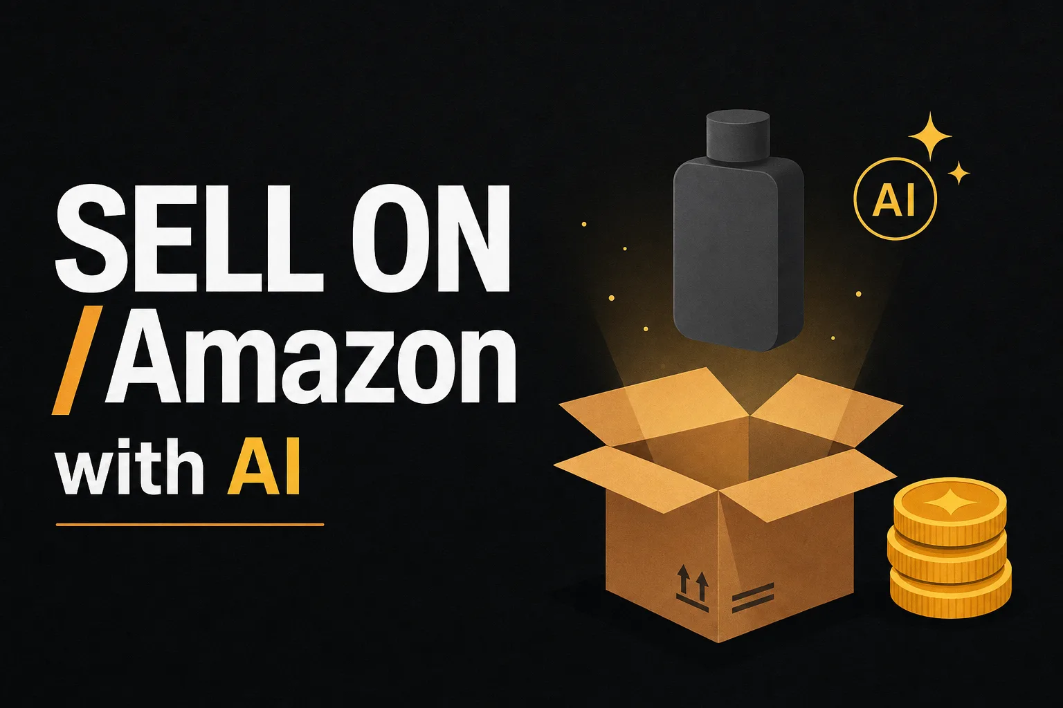
Launch a winning Amazon listing using the real Vuela tools: paste the product URL into the AI Product Description Generator, restyle product images, generate the main image video and produce UGC ads. Step by step.
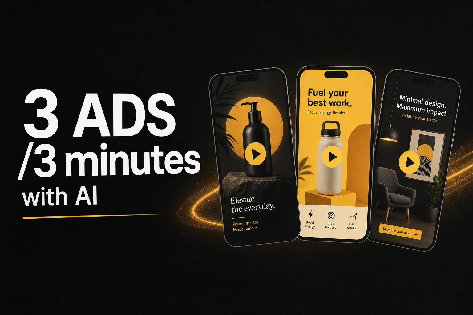
A video ad costs $2,000 and 2 weeks. With Vuela Ad Composer we created 3 ads in 3 minutes for $3. Real examples: product, service, and viral.
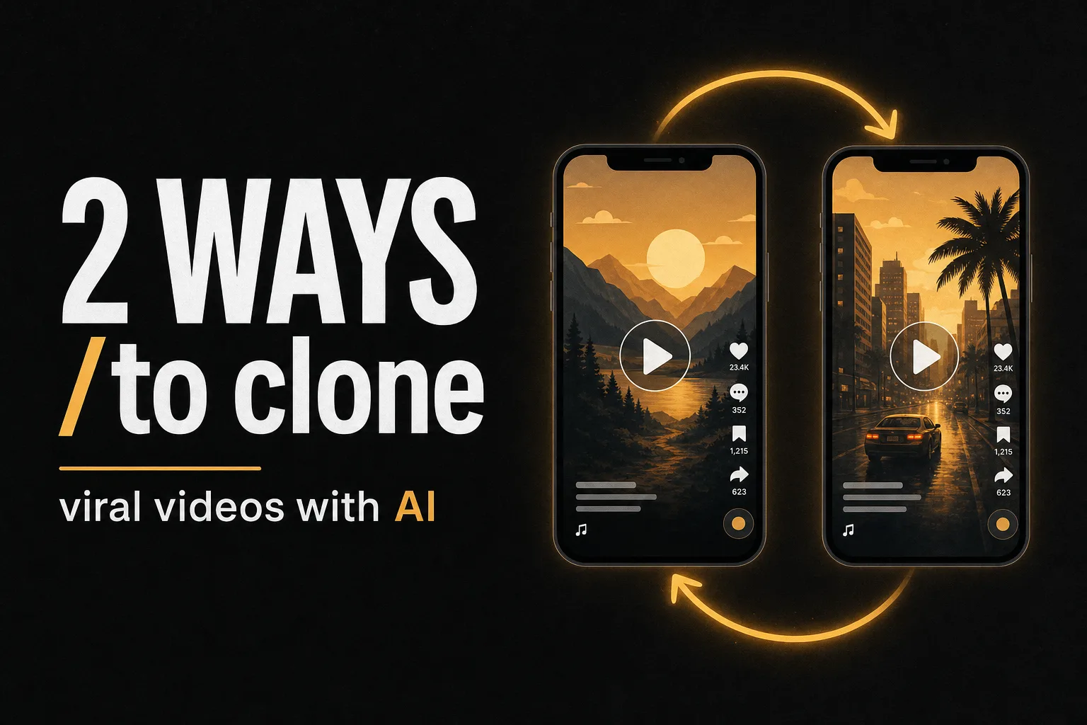
Search viral TikToks, Reels, and Shorts in your niche with the Viral Finder, then clone them with AI: one-click with the Cloner, or rewrite the script with Video to Video. Side-by-side guide.
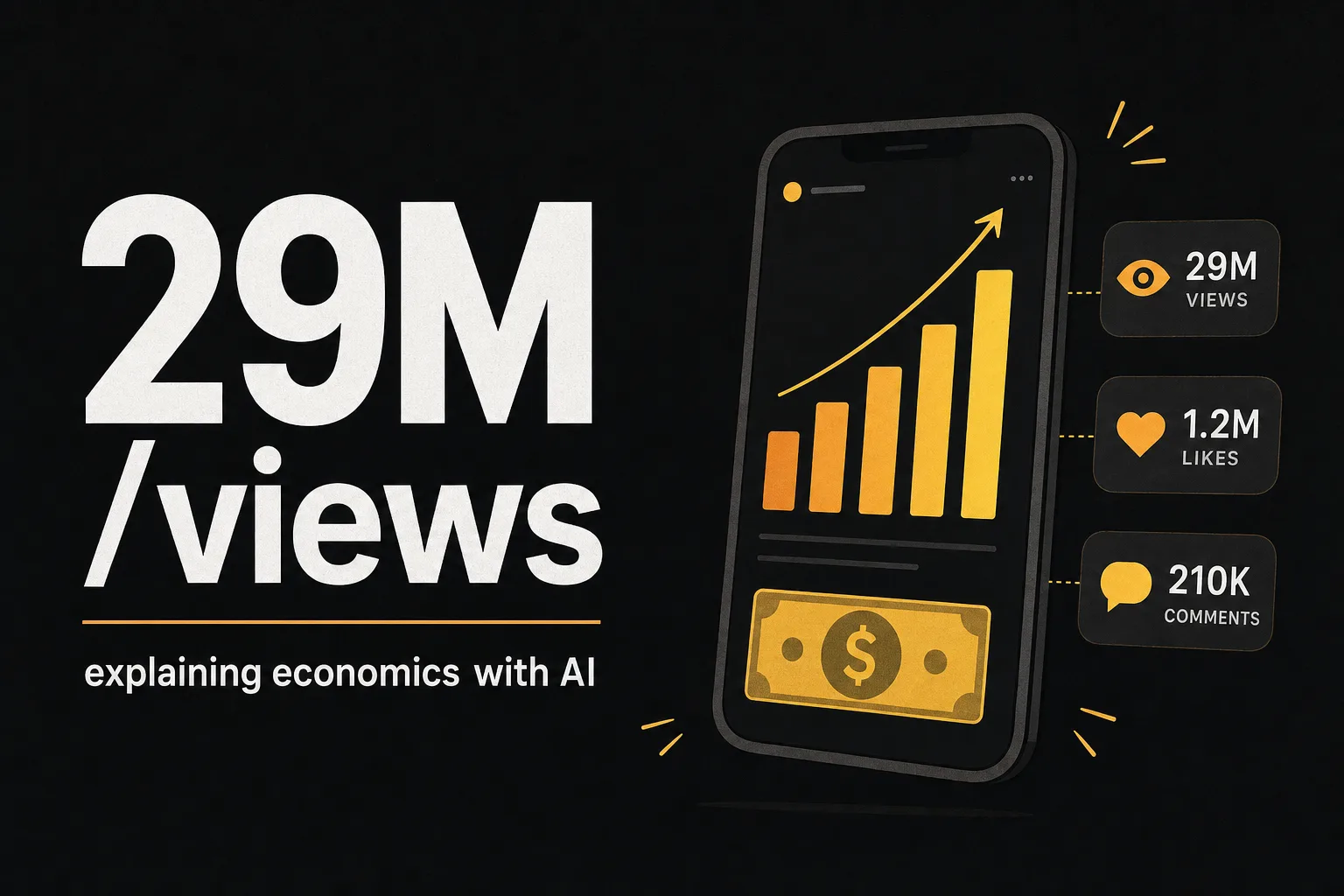
Learn how to clone videos from channels like Primate Economics (550K subs, 29M views) with Vuela's Video Cloner V2. Step by step in any language.
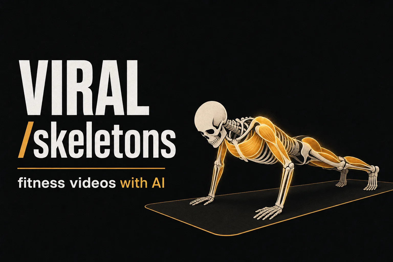
Learn how to create skeleton exercise videos with AI. The trend averaging 3.9M views per video. Step-by-step guide with Vuela.
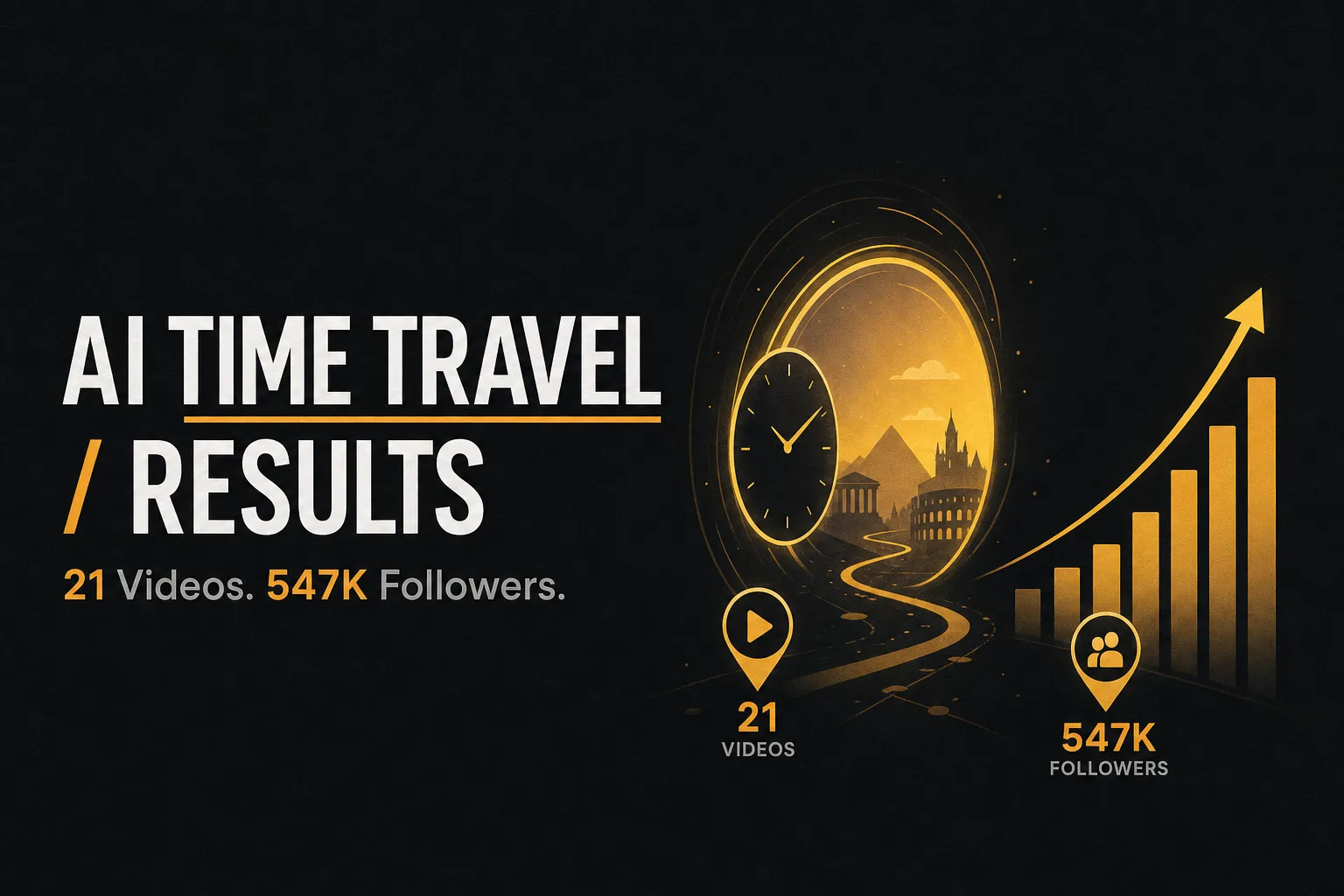
@chloe.vs.history has 547K followers with 21 AI-generated time travel videos. Single videos with 4.3M likes. Here's how to create your own in 5 minutes.
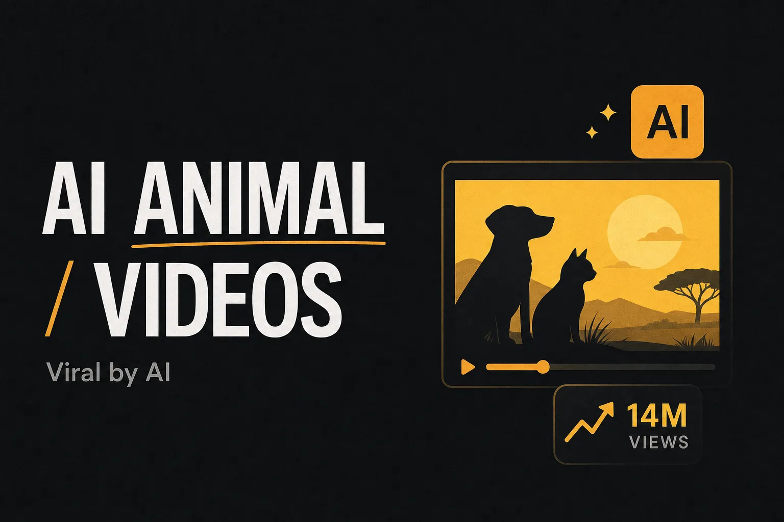
A channel created in February 2026 already has 14.5M views with videos of animals exploring burrows — all AI-generated. Full process in under 1 minute.
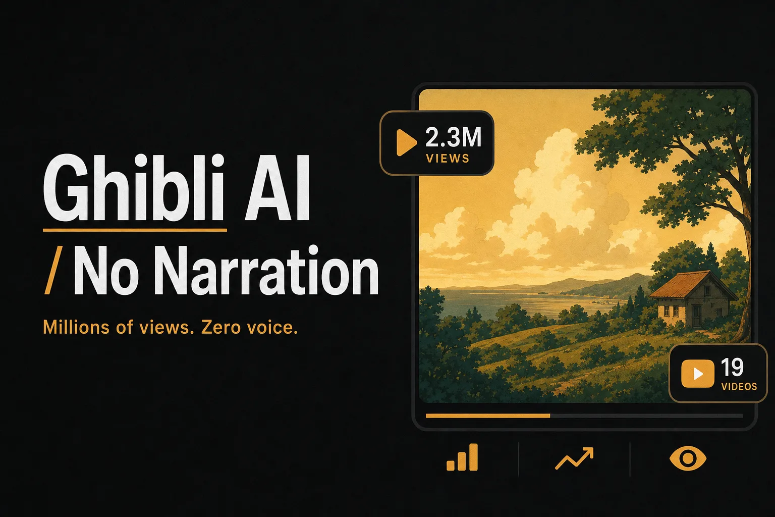
YouTube channels are generating millions of views with Ghibli-style AI animated stories. No narration, no camera. Here's the complete 9-step process.
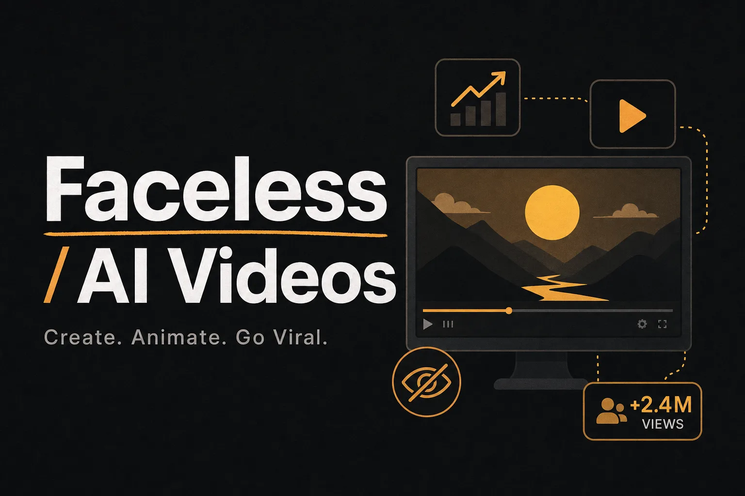
A channel with 21 videos and 134K subscribers gets 2.4M views per video. No camera, no face, no animation skills. Learn how to replicate it in 5 minutes.
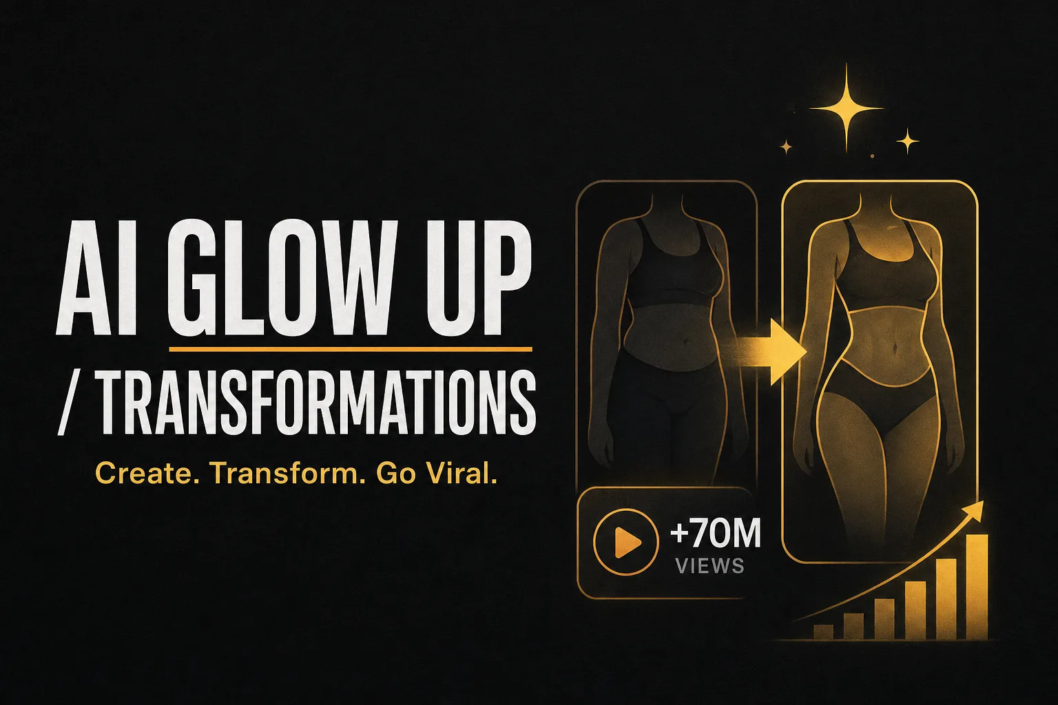
A 64-year-old man went from washed up to jacked. 40M views in a single video. It's not real. It's AI. And you can do it in 5 minutes.
A Minions video with a grandpa has 4.8M views. A Pixar-style panda, 5.6M. Now you can create yours in 5 minutes.
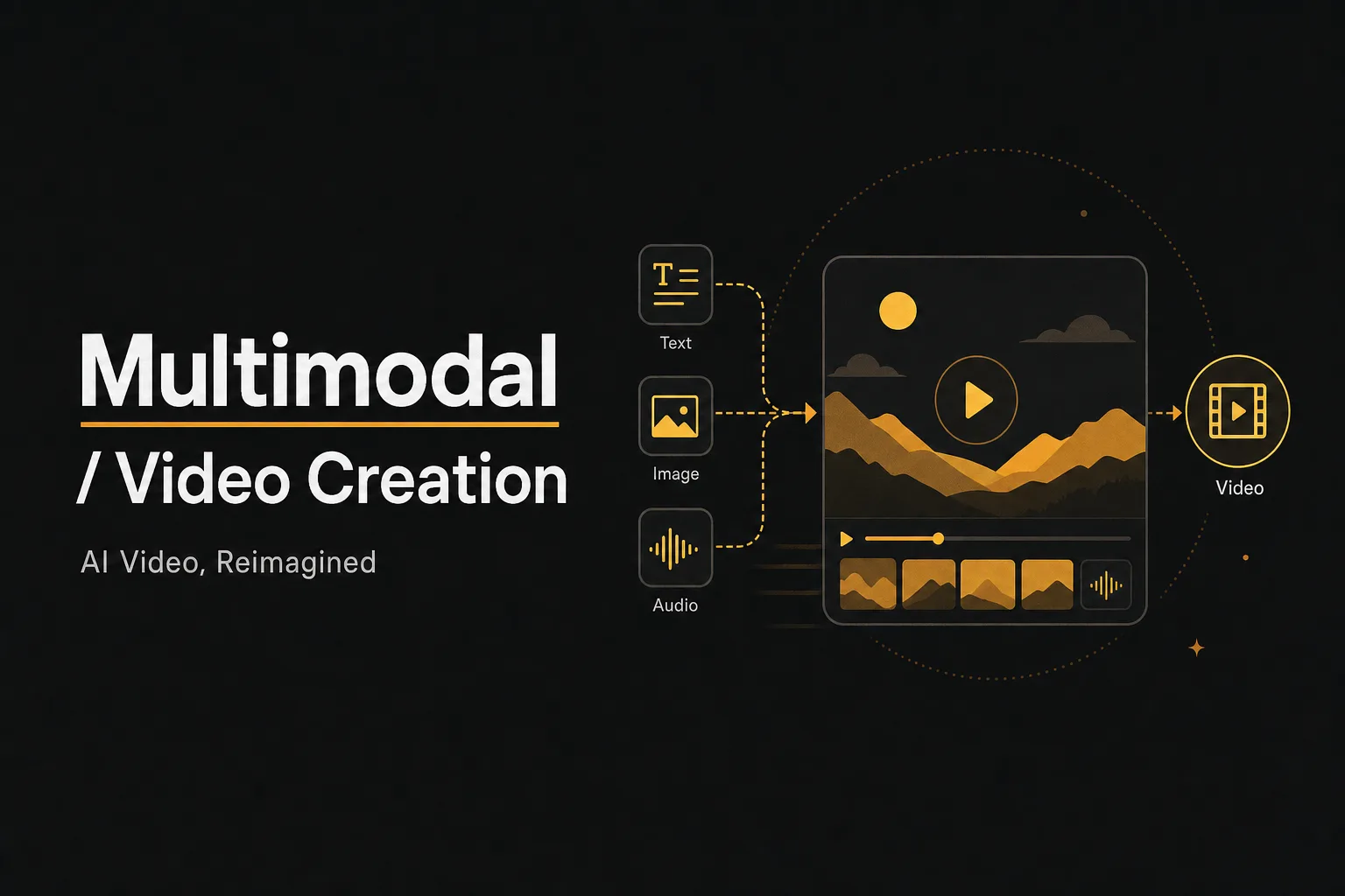
Complete Seedance 2.0 guide with camera movement system, multimodal reference syntax, prompt templates, and 10 core capabilities for AI video generation.
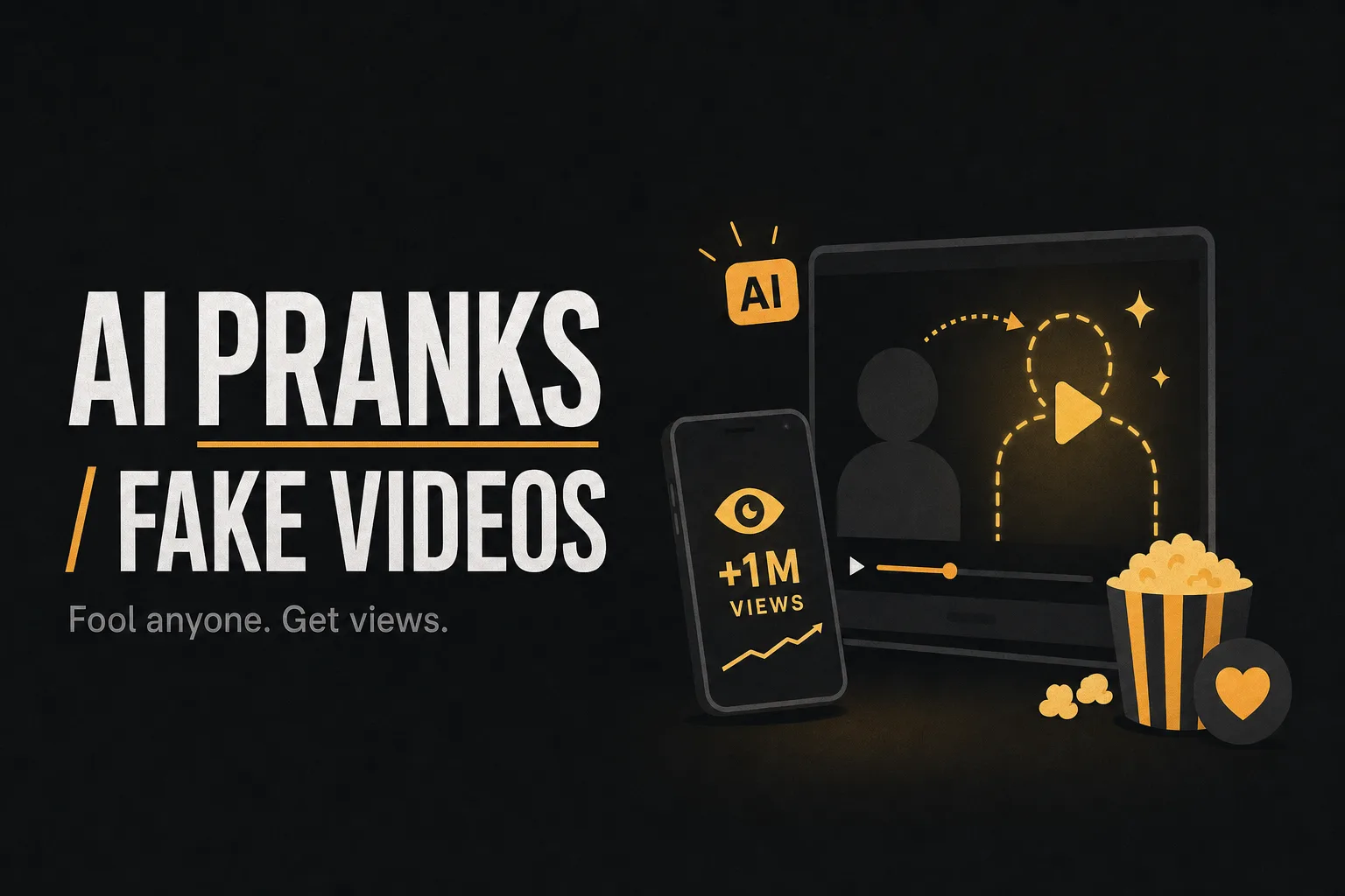
I showed a stranger a video of himself stealing food. He never did it. This is how AI Pranks work, and they're blowing up on TikTok.
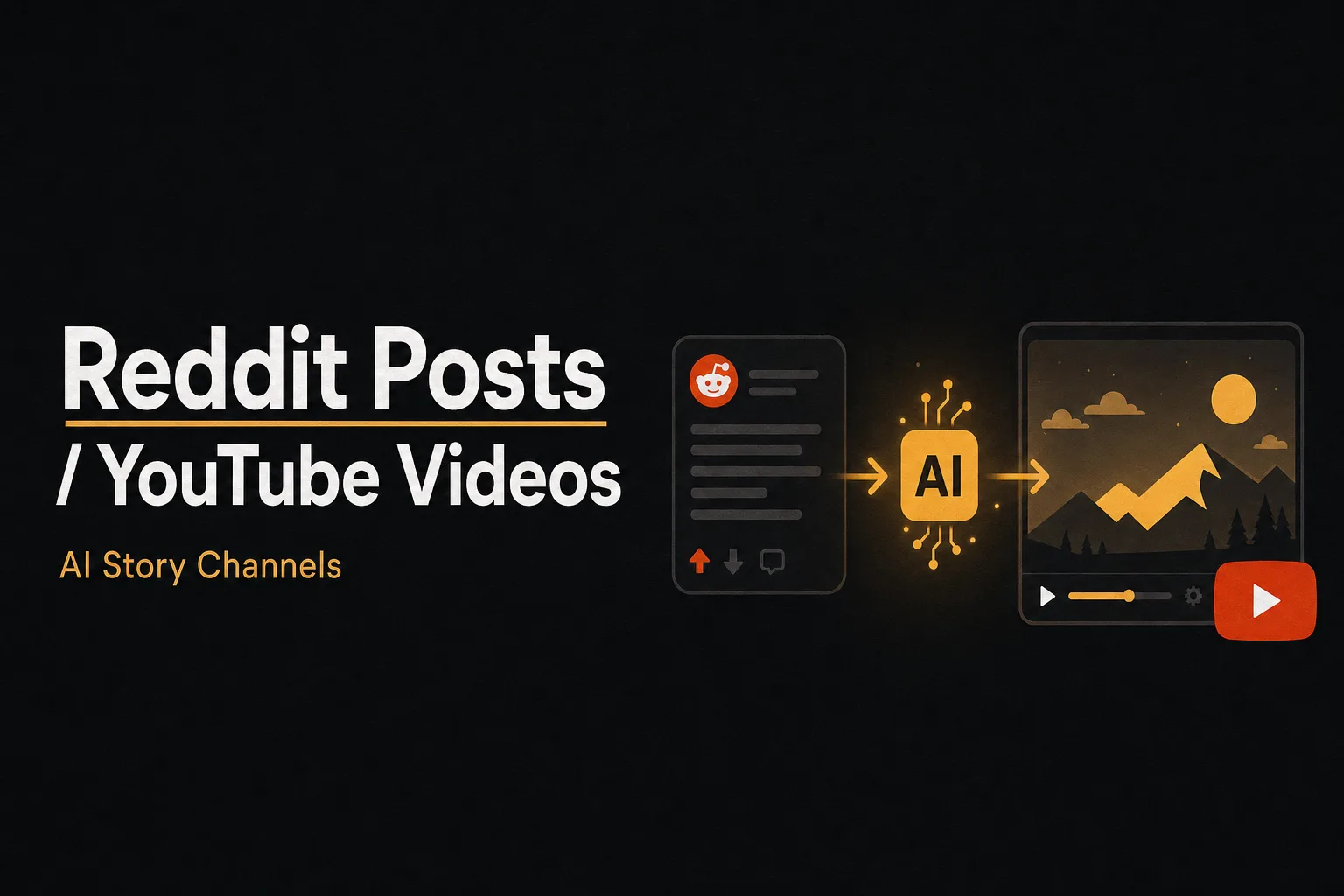
Forget about expensive animation teams. Turn Reddit threads into viral empires using Vuela.
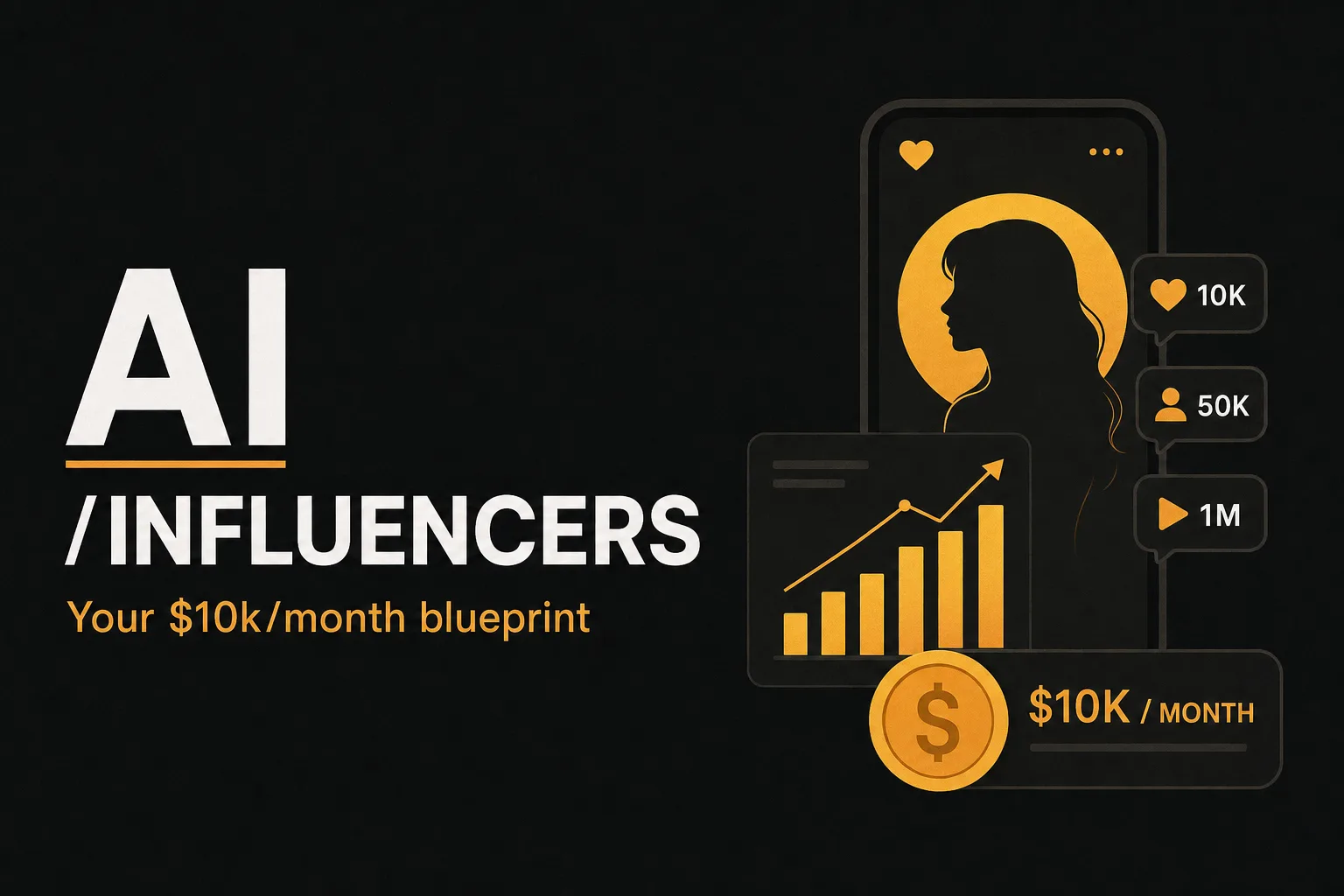
Aitana Lopez and Lil Miquela make millions without existing. Now, you can replicate their success with the new Motion Transfer technology.
An angry toothbrush has 721K views on TikTok. An orange giving health advice, millions. Now you can create your own in 5 minutes.
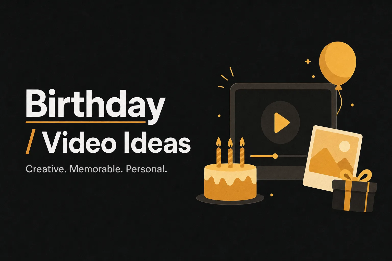
Discover 12 creative birthday video ideas for 2026—from AI celebrity greetings to throwback compilations—plus tips and easy templates from vuela.ai.
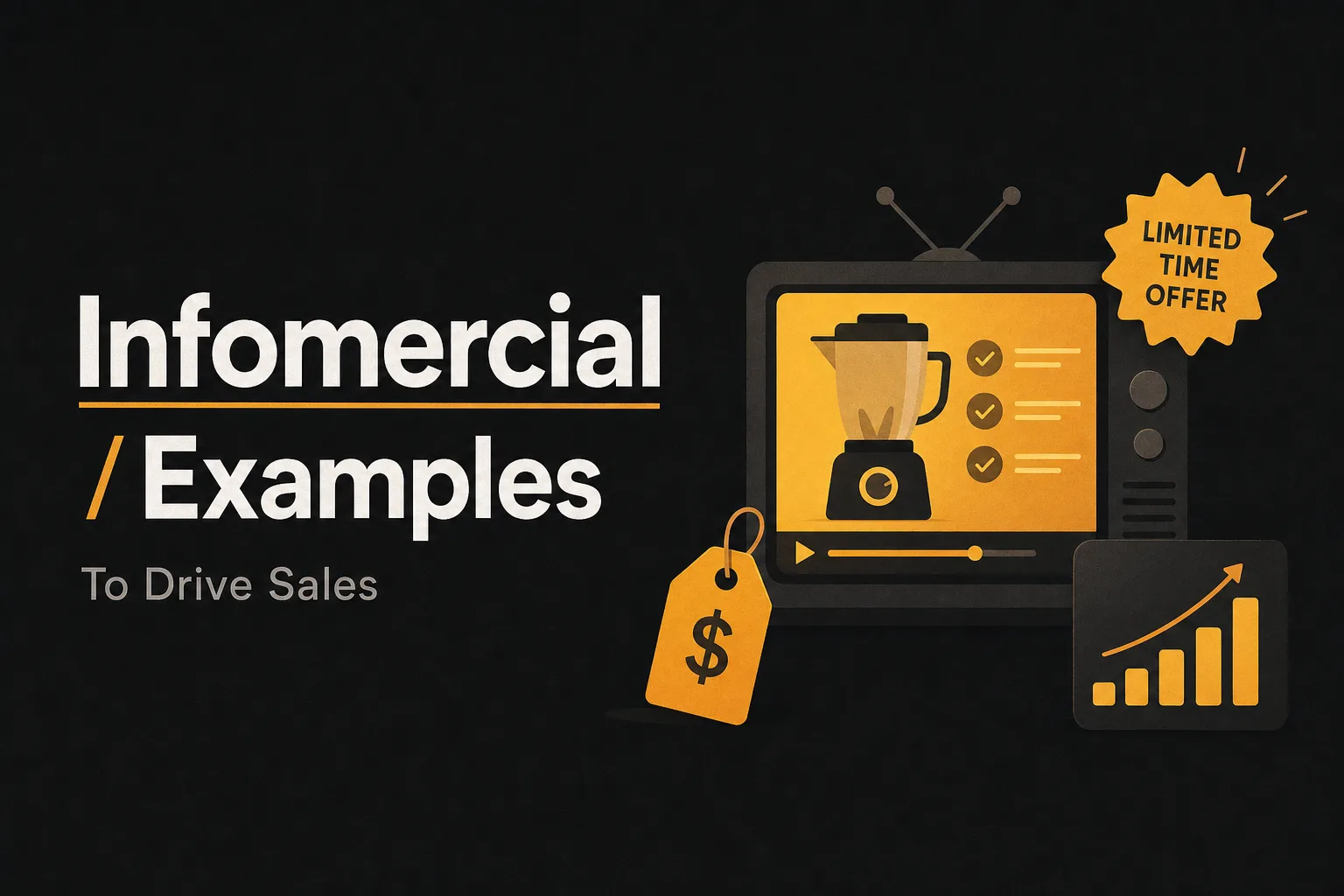
Discover the 20 best infomercial examples, proven frameworks, script-writing tips, and CTA strategies to boost your sales fast.

Discover 15+ faceless YouTube channel ideas for 2026, plus AI tools, monetization strategies, and a step-by-step beginner's guide to get started.

Find your ideal YouTube niche for 2026 with real CPM data, faceless channel tips, niche frameworks, and beginner steps to grow faster.
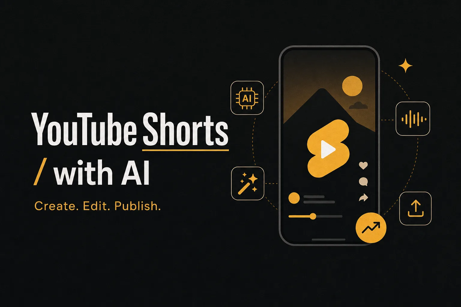
Learn how to create YouTube Shorts with AI tools step by step, covering top tools, YouTube's native features, disclosure rules, and more.
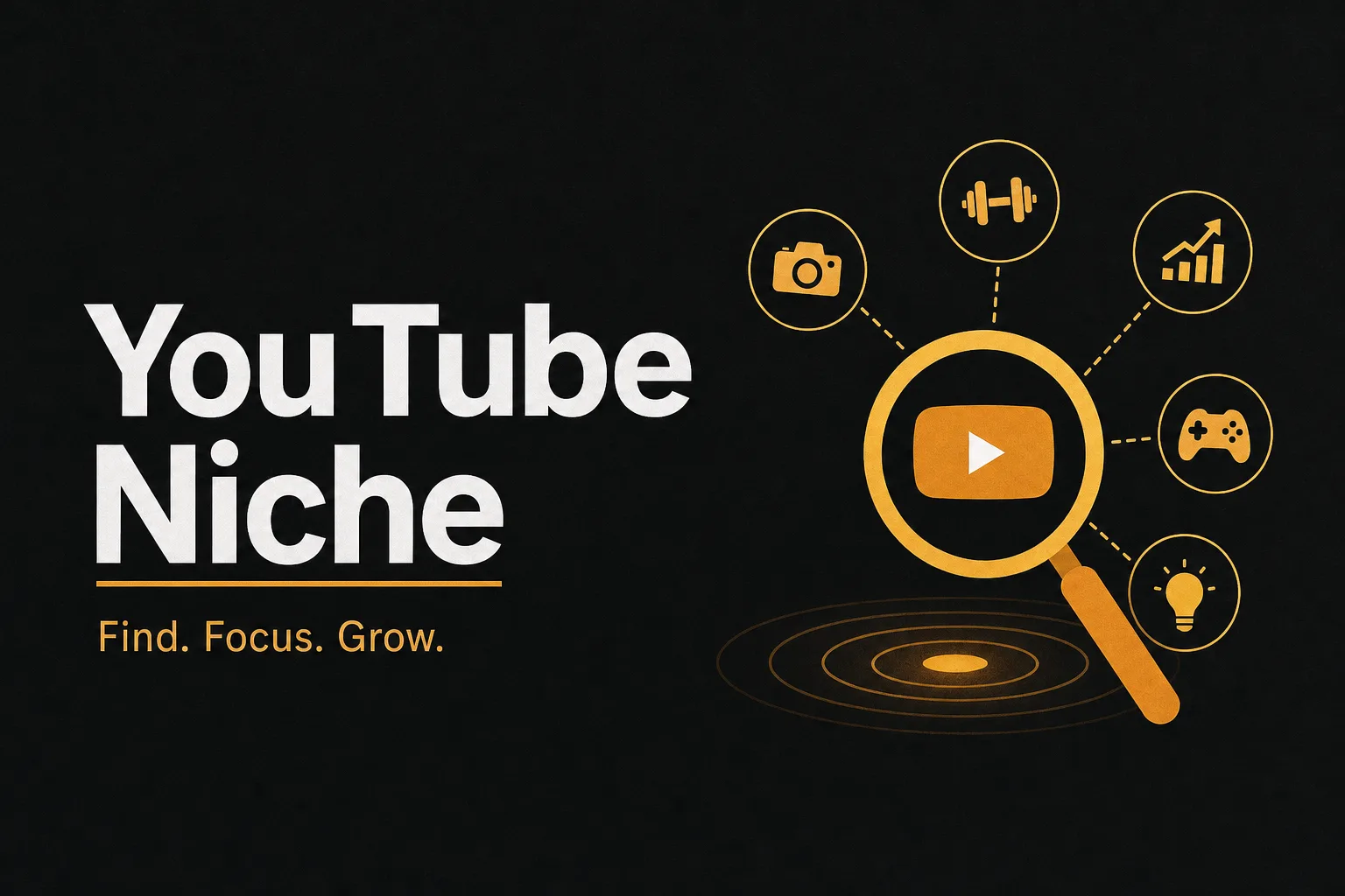
Discover the most profitable YouTube niches in 2026, with CPM data, competition levels, micro-niche strategies, and tools to validate your idea fast.
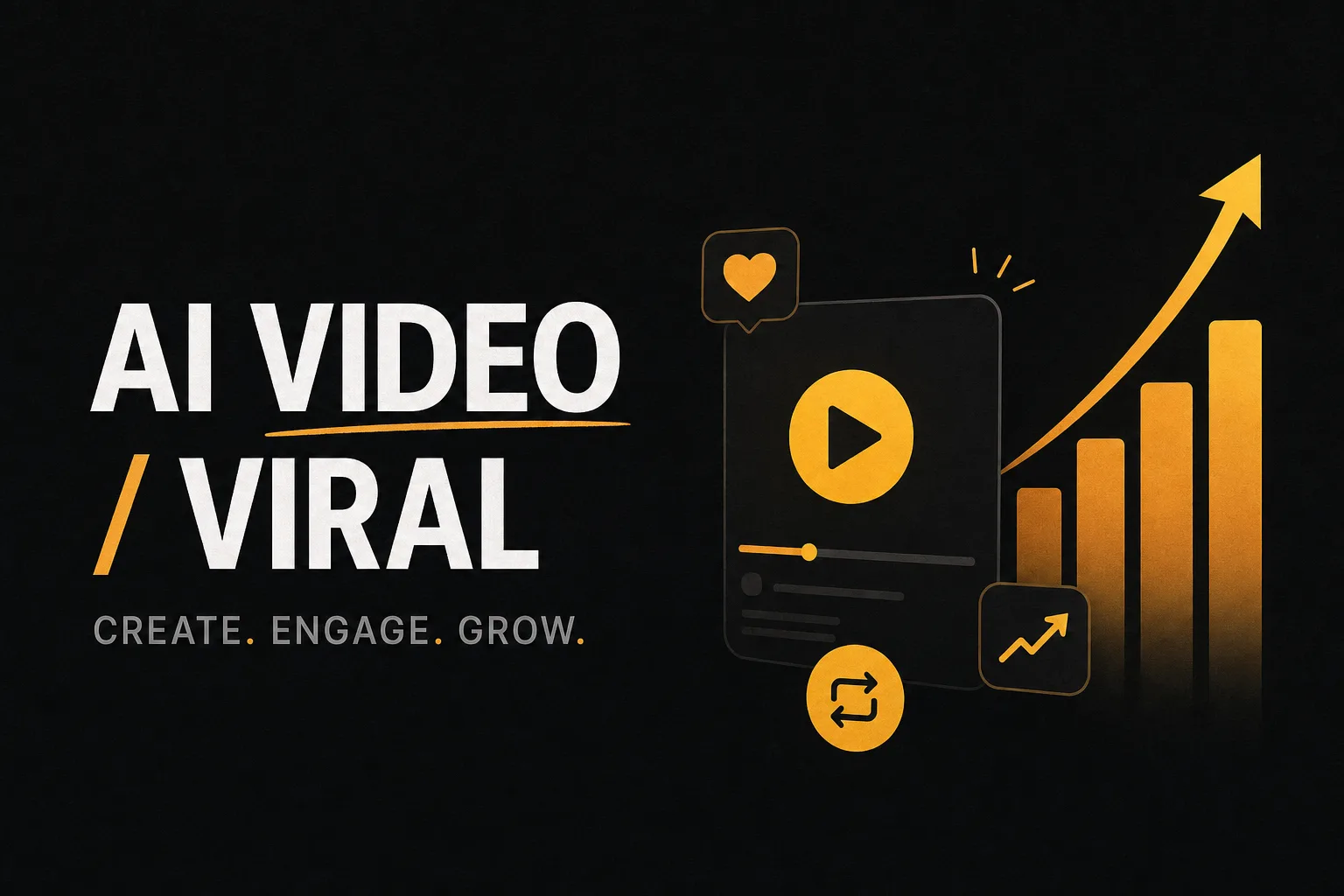
Discover how to create viral content using AI tools like Vuela.ai. Learn insider strategies for producing engaging videos that reach millions, optimizing for algorithms, and leveraging AI video generation for maximum impact on social media.
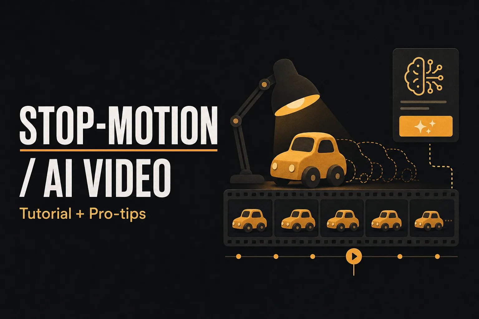
Learn how to create captivating stop-motion videos using Vuela with our step-by-step guide. Transform simple photos into professional animated content with planning tips, platform settings, and expert techniques for stunning results.
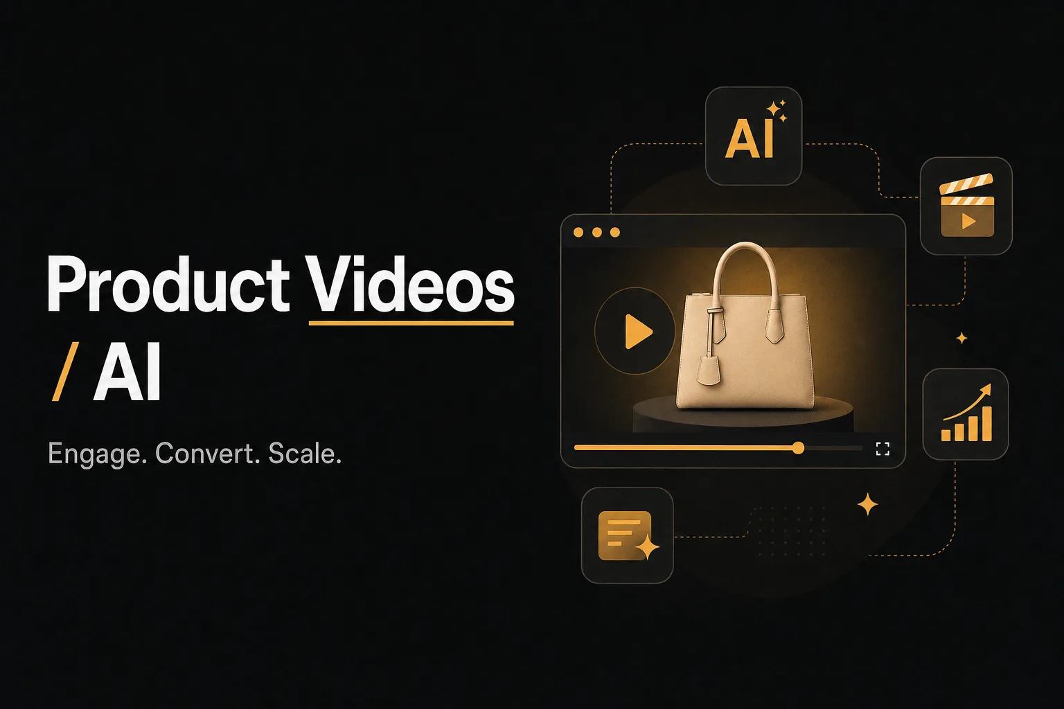
Learn how to create and implement high-converting product videos for your e-commerce store using Vuela AI. Transform product listings into engaging visual content that drives sales in just minutes, no video editing skills required.
Learn how to create realistic, talking AI avatar videos with Vuela AI. No camera or studio needed. Step-by-step guide inside.

Transform your creativity with AI in Dragon Ball video creation. Explore how Vuela AI enables fans to craft personalized, professional-quality anime content.
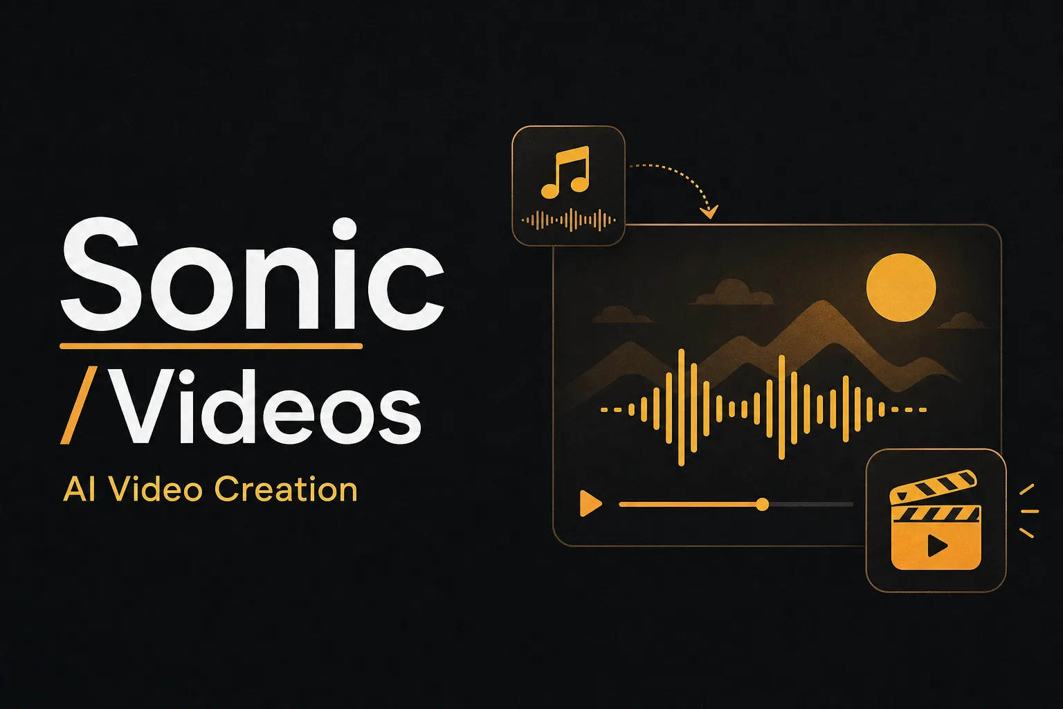
Discover how Vuela AI transforms Sonic video creation, merging intuitive tools and AI to enhance storytelling and engage fans. Elevate your content today.
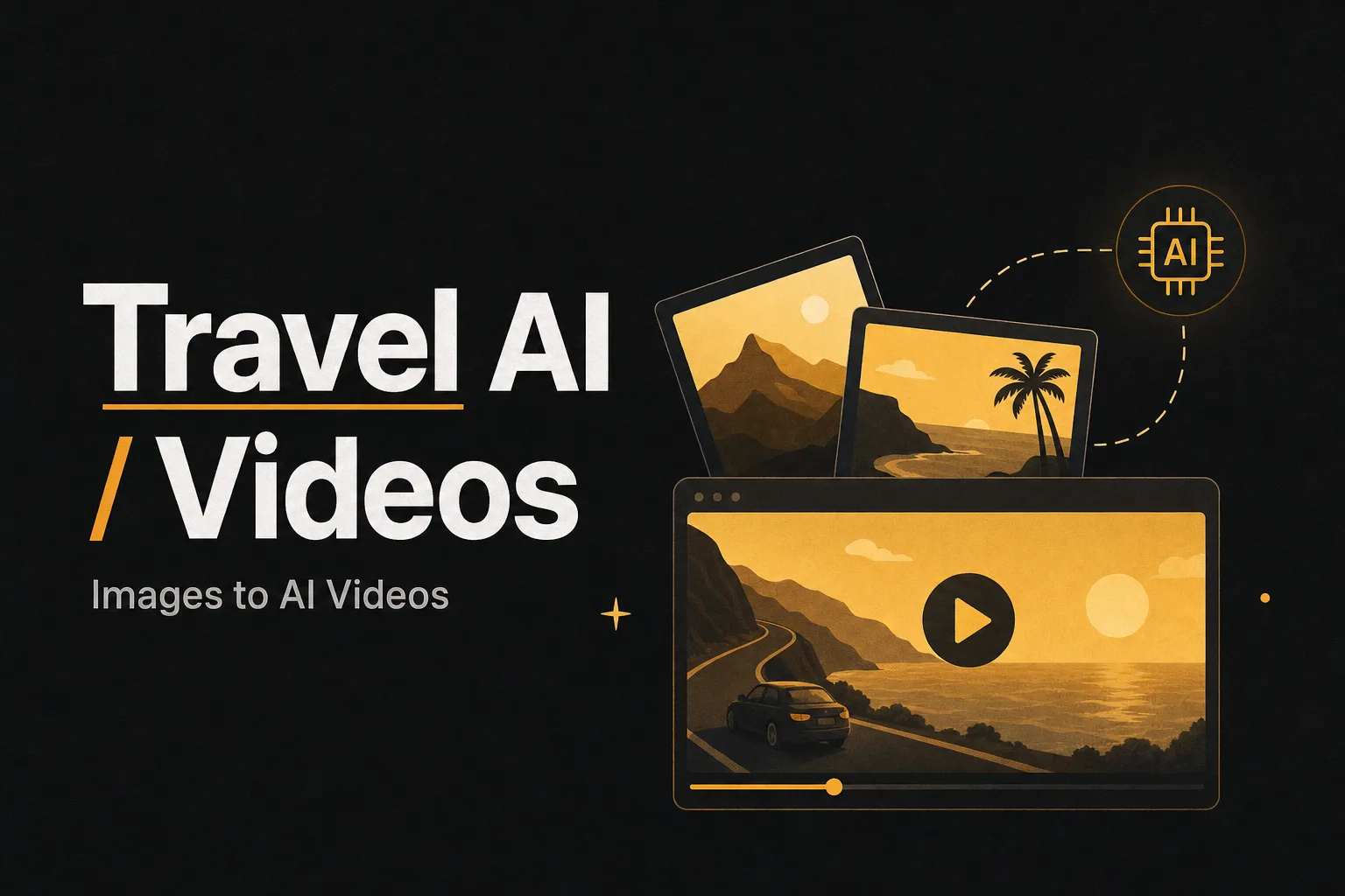
Learn how to make captivating travel videos using AI. Simplify video production with automated tools and share your unique travel stories effortlessly.

Discover how AI is transforming Minecraft with smarter NPCs, autonomous agents, real-world research, and what the future holds for AI-driven gaming.
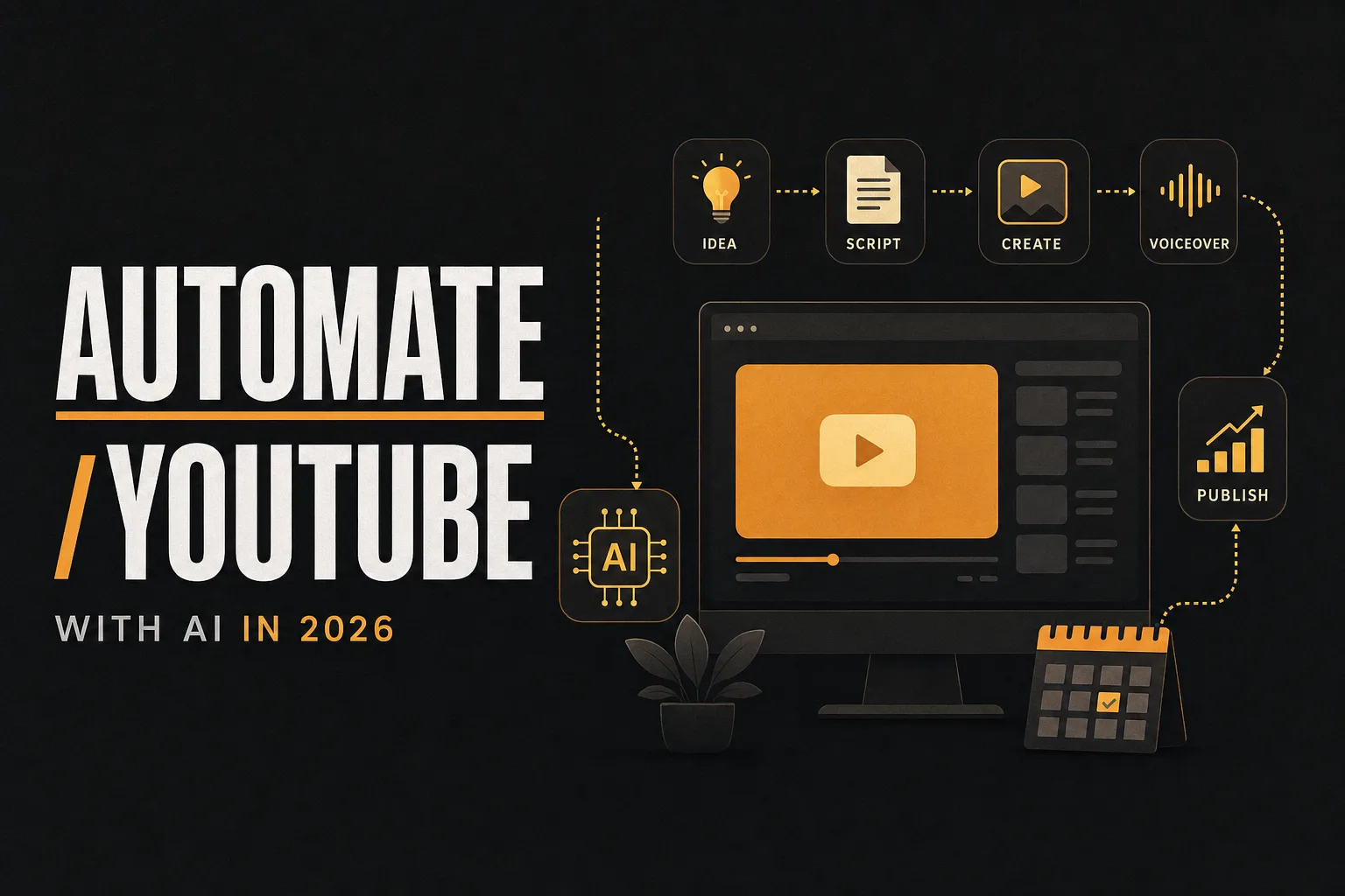
Learn how to automate your YouTube channel with AI in 2026, from scripting to publishing, with the best tools, workflows, and budget tips.
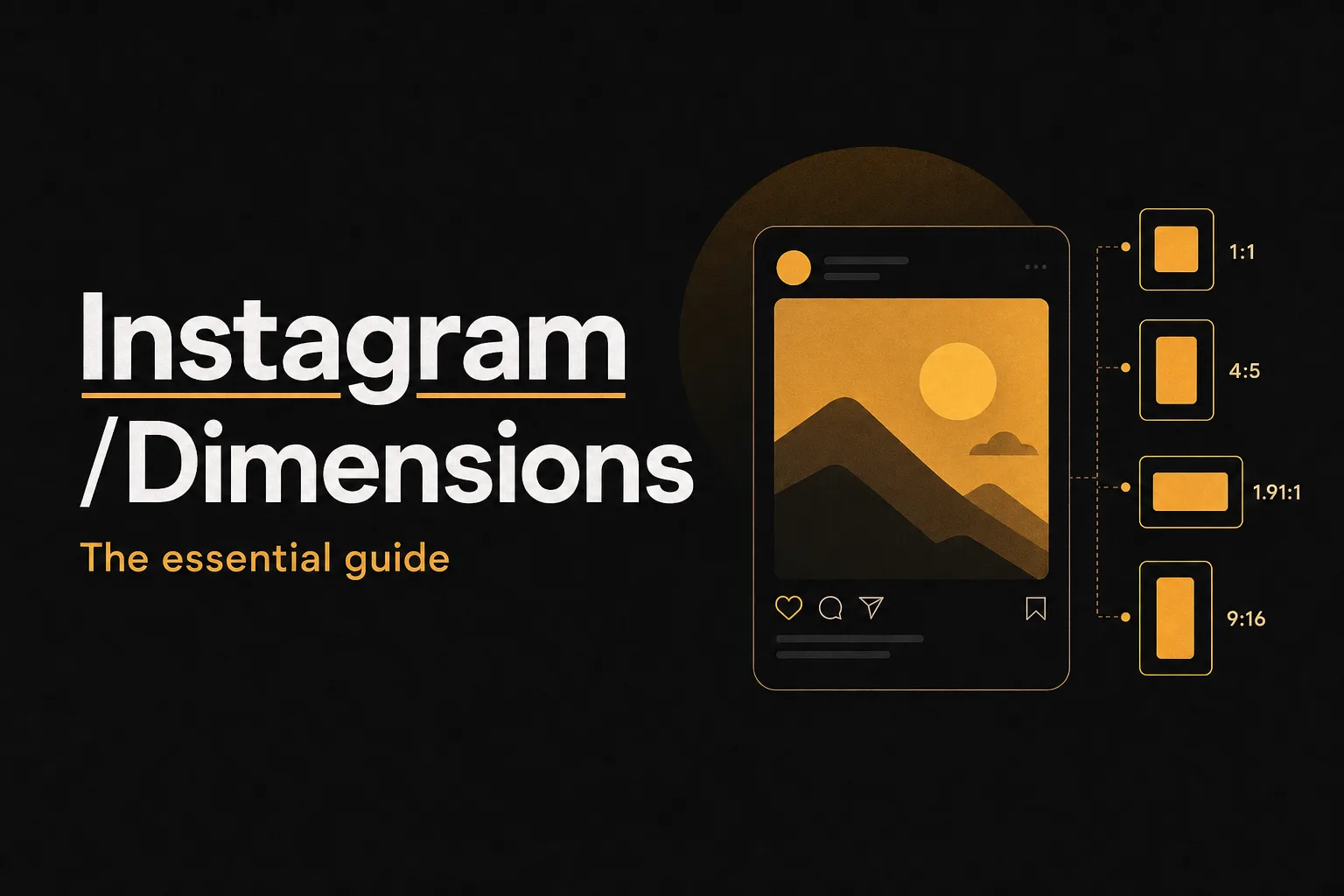
Everything you need to know about Instagram post dimensions in 2026, from feed photos to Reels, carousels, and profile images.
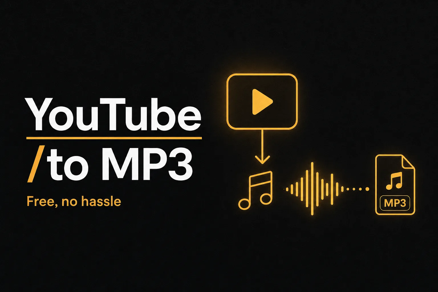
Convert any YouTube video to MP3 for free in seconds. No registration, no software needed. Works on all devices and browsers.
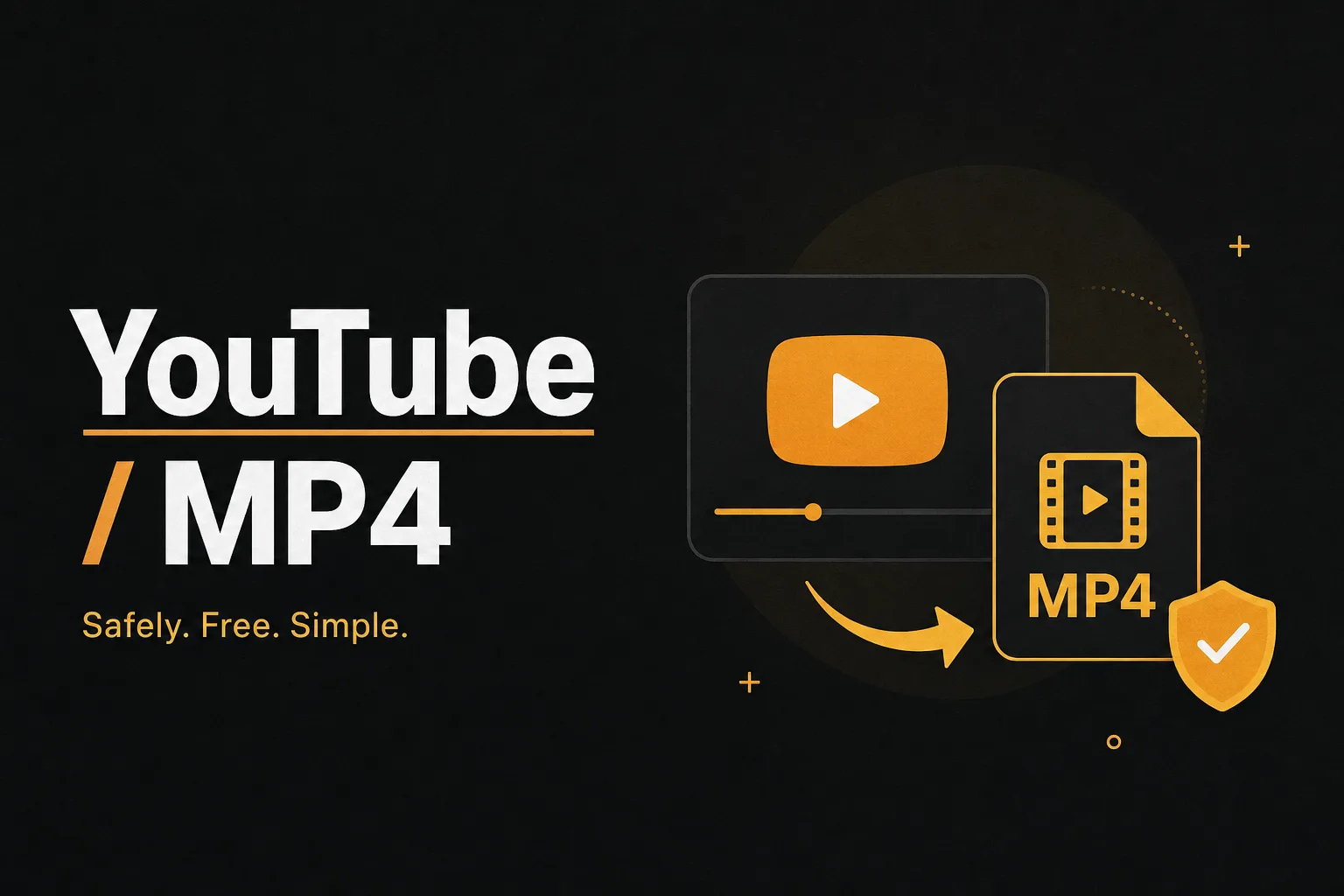
Discover how to convert YouTube videos to MP4 safely with top tools. Learn about legal considerations and ensure high-quality, secure downloads.
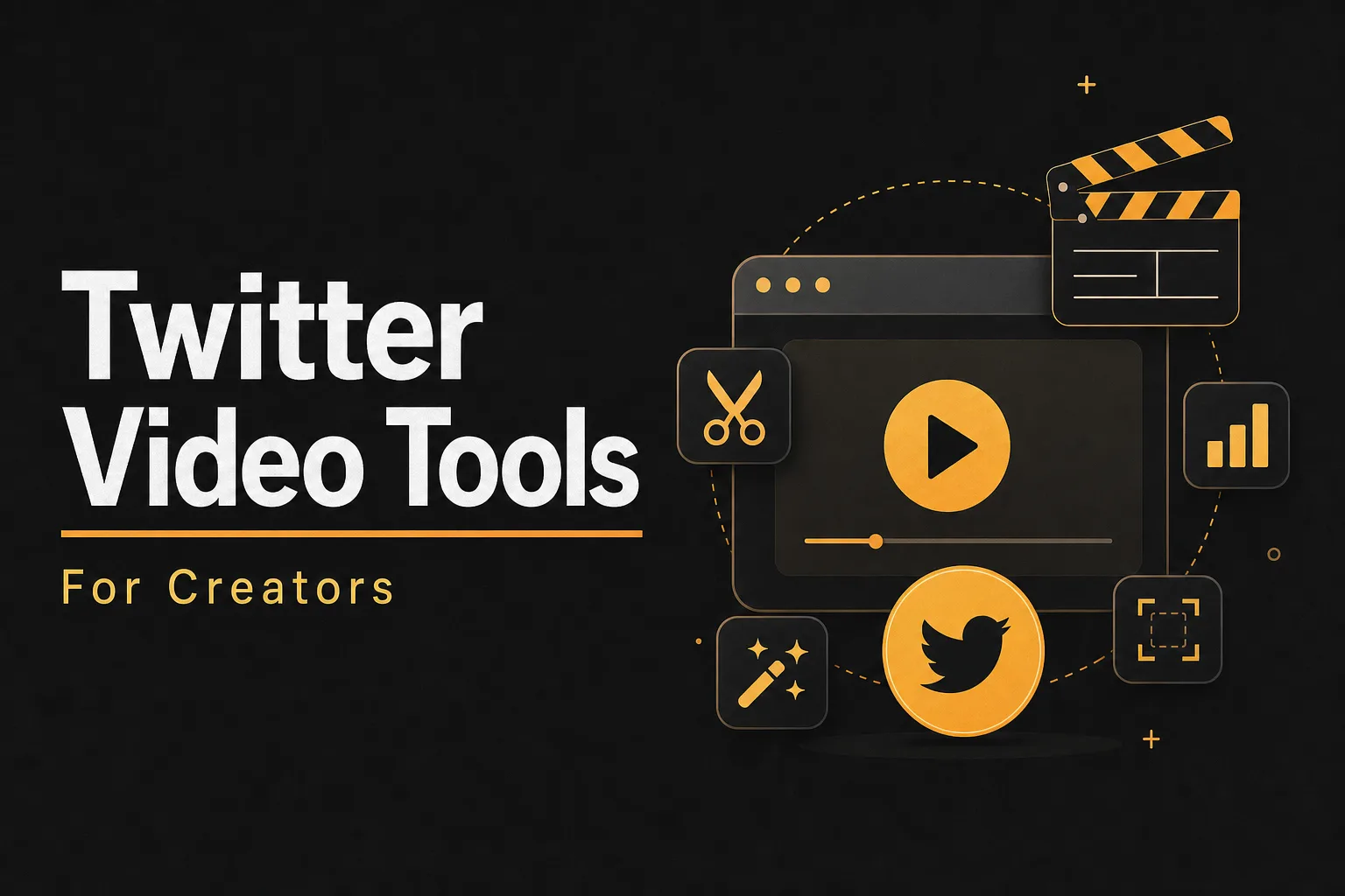
Discover the best video tools to enhance your Twitter content. Explore features, user experiences, and how to boost engagement with top video editors.
Discover how to monetize YouTube with Creative Commons content and AI tools. Learn strategies for passive income without creating videos yourself.
Learn how to use emojis strategically in copywriting to boost engagement, build brand personality, and avoid common pitfalls.
Learn how to get 100K views on YouTube Shorts with proven strategies, AI tools, and step-by-step tips using Vuela AI.